 Ant Design
Ant Design allows you to customize our design tokens to satisfy UI diversity from business or brand requirements, including primary color, border radius, border color, etc.
Ant Design Less variables#
We are using Less as the development language for styling. A set of less variables are defined for each design aspect that can be customized to your needs.
There are some major variables below, all less variables could be found in Default Variables.
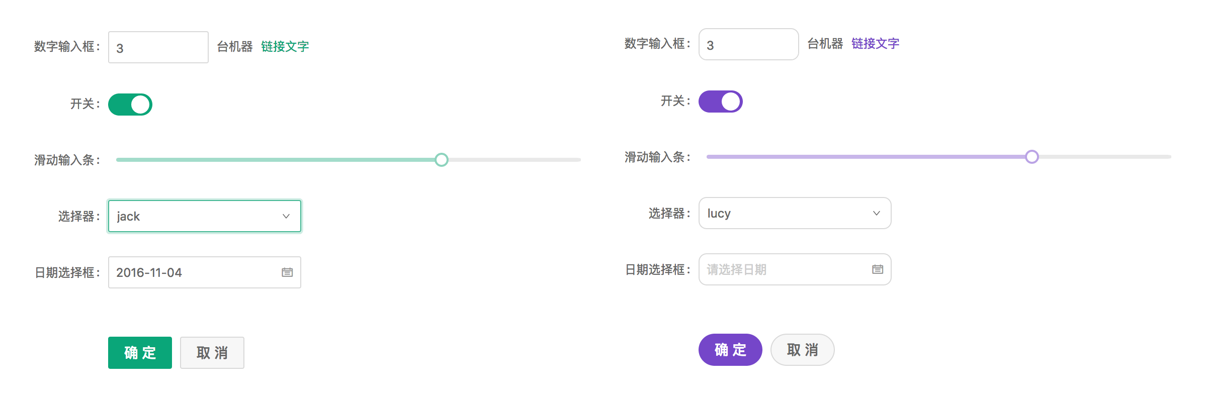
@primary-color: #1890ff; // primary color for all components
@link-color: #1890ff; // link color
@success-color: #52c41a; // success state color
@warning-color: #faad14; // warning state color
@error-color: #f5222d; // error state color
@font-size-base: 14px; // major text font size
@heading-color: rgba(0, 0, 0, 0.85); // heading text color
@text-color: rgba(0, 0, 0, 0.65); // major text color
@text-color-secondary: rgba(0, 0, 0, 0.45); // secondary text color
@disabled-color: rgba(0, 0, 0, 0.25); // disable state color
@border-radius-base: 2px; // major border radius
@border-color-base: #d9d9d9; // major border color
@box-shadow-base: 0 3px 6px -4px rgba(0, 0, 0, 0.12), 0 6px 16px 0 rgba(0, 0, 0, 0.08),
  0 9px 28px 8px rgba(0, 0, 0, 0.05); // major shadow for layers
Please report an issue if the existing list of variables is not enough for you.
How to do it#
We will use modifyVars provided by less.js to override the default values of the variables, You can use this example as a live playground. We now introduce some popular way to do it depends on different workflow.
Customize in webpack#
We take a typical webpack.config.js file as example to customize its less-loader options.
// webpack.config.js
module.exports = {
  rules: [{
    test: /\.less$/,
    use: [{
      loader: 'style-loader',
    }, {
      loader: 'css-loader', // translates CSS into CommonJS
    }, {
      loader: 'less-loader', // compiles Less to CSS
+     options: {
+       lessOptions: { // If you are using less-loader@5 please spread the lessOptions to options directly
+         modifyVars: {
+           'primary-color': '#1DA57A',
+           'link-color': '#1DA57A',
+           'border-radius-base': '2px',
+         },
+         javascriptEnabled: true,
+       },
+     },
    }],
    // ...other rules
  }],
  // ...other config
}
Note:
Don't exclude
node_modules/antdwhen using less-loader.lessOptionsusage is supported at less-loader@6.0.0.
Customize in Umi#
You can easily use theme field in .umirc.ts or config/config.ts file of your project root directory if you are using Umi, which could be an object or a javascript file path.
"theme": {
  "primary-color": "#1DA57A",
},
Or just a javascript file path:
"theme": "./theme.js",Customize in create-react-app#
Follow Use in create-react-app.
Customize in less file#
Another approach to customize theme is creating a less file within variables to override antd.less.
@import '~antd/es/style/themes/default.less';
@import '~antd/dist/antd.less'; // Import Ant Design styles by less entry
@import 'your-theme-file.less'; // variables to override above
Note: This way will load the styles of all components, regardless of your demand, which cause style option of babel-plugin-import not working.
Dynamic theme#
Runtime update theme color please ref this doc.
How to avoid modifying global styles?#
Currently ant-design is designed as a whole experience and modify global styles (eg body etc). If you need to integrate ant-design as a part of an existing website, it's likely you want to prevent ant-design to override global styles.
While there's no canonical way to do it, you can take one of the following paths :
Configure webpack to load an alternate less file and scope global styles#
It's possible to configure webpack to load an alternate less file:
new webpack.NormalModuleReplacementPlugin( /node_modules\/antd\/lib\/style\/index\.less/, path.resolve(rootDir, 'src/myStylesReplacement.less') )

#antd { @import '~antd/es/style/core/index.less'; @import '~antd/es/style/themes/default.less'; }
Where the src/myStylesReplacement.less file loads the same files as the index.less file, but loads them within the scope of a top-level selector : the result is that all of the "global" styles are being applied with the #antd scope.
Use a postcss processor to scope all styles#
See an example of usage with gulp and postcss-prefixwrap.
Not working?#
You must import styles as less format. A common mistake would be importing multiple copied of styles that some of them are css format to override the less styles.
If you import styles by specifying the
styleoption of babel-plugin-import, change it from'css'totrue, which will import thelessversion of antd.If you import styles from
'antd/dist/antd.css', change it toantd/dist/antd.less.
Official Themes 🌈#
We have some official themes, try them out and give us some feedback!
🌑 Dark Theme (supported in 4.0.0+)
📦 Compact Theme (supported in 4.1.0+)
Use dark or compact theme#

Method 1: using Umi 3
If you're using Umi 3:
// .umirc.ts or config/config.ts
export default {
  antd: {
    dark: true, // active dark theme
    compact: true, // active compact theme
  },
},
Method 2: Import antd/dist/antd.dark.less or antd/dist/antd.compact.less in the style file:
@import '~antd/dist/antd.dark.less'; // Introduce the official dark less style entry file
@import '~antd/dist/antd.compact.less'; // Introduce the official compact less style entry file
If the project does not use Less, you can import antd.dark.css or antd/dist/antd.compact.css in the CSS file:
@import '~antd/dist/antd.dark.css';
@import '~antd/dist/antd.compact.css';
Note that you don't need to import
antd/dist/antd.lessorantd/dist/antd.cssanymore, please remove it, and remove babel-plugin-importstyleconfig too. You can't enable two or more theme at the same time by this method.
Method 3: using less-loader in webpack.config.js to introduce as needed:
const { getThemeVariables } = require('antd/dist/theme');

// webpack.config.js
module.exports = {
  rules: [{
    test: /\.less$/,
    use: [{
      loader: 'style-loader',
    }, {
      loader: 'css-loader', // translates CSS into CommonJS
    }, {
      loader: 'less-loader', // compiles Less to CSS
+     options: {
+       lessOptions: { // If you are using less-loader@5 please spread the lessOptions to options directly
+         modifyVars: getThemeVariables({
+           dark: true, // Enable dark mode
+           compact: true, // Enable compact mode
+         }),
+         javascriptEnabled: true,
+       },
+     },
    }],
  }],
};